I'm in a blue period.
Picasso had one so if it's good enough for him it's good enough for me.
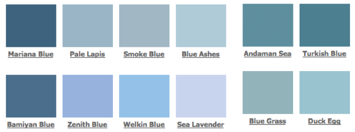
However, the blue of which I speak is a very, very specific blue.
Think periwinkle or powder blue, with just a hint of cornflower.
But paler.
I think I must be a bit OCD with colour. A microshade away from my 'perfect' colour is way out. It has to be just right. I have been known to repaint a room several times in the search for just the right shade of a specific colour.
I think that possibly this is why most people opt for neutrals. It's impossible to go wrong with white, or off white, or something with the merest hint of.....
I wish I was more adventurous with colour but I'm from the generation that would never, ever team navy with anything other than white (never, ever, dog forbid..... brown)
Obviously, growing up as a teenager in the 70s I've developed a lifelong aversion to purple and orange which no amount of CBT could ever eradicate.
I come over all queasy if I encounter pink and orange in close proximity, and there's something about bright, vibrant turquoise I can't cope with.
I'm reasonably comfortable with reds, but only specific reds. Burgundy is generally a complete no-no. But crimson..... ahh, now you're talking.
I think I've outgrown my obsessively, passionate, love affair with yellow, but I still have the occasional relapse.
Mostly I've matured into appreciating the blue spectrum (aside from bright turquoise) and that's why I'm currently torturing myself trying to find the exact right shade of blue for my workroom walls. Initially I thought the best course of action would be white, but given that I'm doing all the cupboard doors white I thought that the overall effect might be akin to working inside the sun.
Too bright.
The room gets a lot of direct sunlight during the day and I don't want to have to wear a welder's mask and sunglasses just to walk in.
Psychologically speaking........."the colour of the sky and the ocean, blue is one of the most popular colours. Peaceful, tranquil blue causes the body to produce calming chemicals, so it is often used in bedrooms. Blue can also be cold and depressing. People are more productive in blue rooms. Studies show weightlifters are able to handle heavier weights in blue gyms."
So, taking the salient points, I'm going to be calmer, more productive, and better able to heft heavy boxes from the top shelves, in a blue room.
Result.
No comments:
Post a Comment